Saturday, April 23, 2011

Tools to learn somebody else's codebase

Writing code can be a difficult task, but reading it is usually even more challenging. Here's a quick tip to help you the next time you want to make sense of a bunch of code you don't yet know.

My day job is working support for JBoss. If you haven't noticed, JBoss doesn't let much moss collect-- projects are constantly moving, improving and springing up from the ground. If you want to keep up in this environment, you'd better learn to read code and digest it quickly-- and that's the need that produced this solution.

One of the things I like to do is add a quick function to my .profile (we'll see how to use this in a bit):

# Use this with 'tree'. Works with wildcards
getF() { THF=`find . -name $1`;export THF; /usr/bin/gedit $THF & }

I'd use this in conjunction with Linux's excellent 'tree' command. Use 'tree' to quickly see what the source base looks like, then use getF() to easily zero in on files that are of interest.

Let's go with an example. Today I'm looking at the just-released droolsjbpm-integration package (which looks good, and runs some neat examples out of the box, by the way.) So I might start like this:

rick:~/Tools/droolsjbpm-integration-distribution-5.2.0.M2/examples$ tree
.
|-- binaries
| `-- droolsjbpm-integration-examples-5.2.0.M2.jar
|-- runExamples.bat
|-- runExamples.sh
`-- sources
|-- pom.xml
`-- src
|-- main
| |-- java
| | `-- org
| | `-- drools
| | `-- examples
| | |-- broker
| | | |-- BrokerExample.java
| | | |-- Broker.java
| | | |-- BrokerServices.java
| | | |-- events
| | | | |-- EventFeeder.java
| | | | |-- EventGenerator.java
| | | | |-- EventImpl.java
| | | | |-- Event.java
| | | | |-- EventReceiver.java
| | | | |-- EventSource.java
| | | | `-- StockTickPersister.java
| | | |-- misc
| | | | `-- Utils.java
| | | |-- model
| | | | |-- Action.java
| | | | |-- Company.java
| | | | |-- CompanyRegistry.java

(More deleted. You get the picture, though. Get the picture.... get it? Hee hee.)

So we immediately get a view of what's in the codebase. You might see how much code is out there.....

rick:~/Tools/droolsjbpm-integration-distribution-5.2.0.M2/examples$ find sources -name *.java | wc -l
46

So only 46 java artifacts. Pretty reasonable.

If a codebase has a lot of interfaces and inheritence, it can be a little tougher to read. So we might have a look at how much of that is out there....

rick:~/Tools/droolsjbpm-integration-distribution-5.2.0.M2/examples$ find sources -name *.java |xargs egrep 'implements|extends' |wc -l
24

Hmmm, that seems a little rich, for only 46 java files. It could be that you're working with a framework built to allow lots of things like plug-ins and alternative implementation (in a good case) or it could be that you're reviewing code written by someone who reads too many academic textbooks and doesn't really grasp the proper use of such abstractions. In this case, I'm confident it's the first case.

OK, so now let's see how that function we put in .profile can be put to use:

rick:~/Tools/droolsjbpm-integration-distribution-5.2.0.M2/examples$ getF Cell*
[3] 2514

Immediately, my text editor pops up showing me Cell.java, CellState.java, CellGridCanvas.java, CellGridImpl.java, and CellGrid.java.


I grant you, much of this is also available via a nice IDE like JBDS or Eclipse, but sometimes (well, frequently, really) it's hard to wrangle the projects into an IDE without doing a bunch of classpath setup, dependency downloads, etc.

Happy Code Reading!
Saturday, April 16, 2011

Book Review for "R Graphs Cookbook"

Quick! What do James Gosling, Bill Gates, Linus, Bjarne, Larry Ellison, Uncle Bob, Martin Fowler, and Gavin King all have in common?


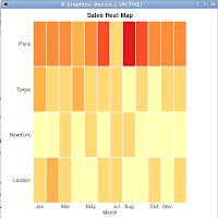
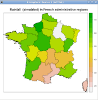
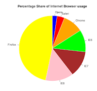
These are all graphs I produced with the book's samples.


They all know how to produce compelling presentations. While some of the above are good programmers (even excellent ones), we don't know of them because of that. We know of them because they influence our thinking. Every programmer who advances through the ranks eventually gets to the point where they need to influence people as well as sling code. (It's all about scalability. One person can only do so much-- but if that one person can effectively influence a group of others-- then the reach of that coder is greatly expanded.) So too it should be with you-- you need to learn how to produce artifacts that will influence people and bolster your arguments.

To that end, I am really pleased with "R Graphs Cookbook" by Packt. If you haven't used R yet-- regardless of whether you read this book or not-- you need to download this excellent open source statistical package and get yourself acquainted. Search this blog for examples, I've posted a few. R makes statistics easy, and statistics can lend assistance to everything from log analysis to garbage collection optimization. This book is about R's excellent graphical capabilities, though.

This book doesn't teach R, and it's target audience is an experienced R programmer. I really think even an R novice could use this book to produce impressive graphs, though-- each recipe is very short and shows what's needed to produce the graph you're after. By the way, I think one of the best parts of this book is the available source code-- you don't even have to type in the examples, and the sample data is invaluable. By the way, studying the way the data is structured is highly educational. I'd strongly recommend examining the data with each recipe to maximize your learning.

The book teaches you how to draw all kinds of graphs: scatter plots, line plots, pie graphs, bar charts, histograms, box and whisker plots, heat maps, contour maps and regular maps. The 'regular maps' covers maps of the world, a country, a state, etc.

If I had a wish to improve this book, I'd wish for a comprehensive index that covers every page where a specific function or argument was used. Sometimes functions are demonstrated in one graph recipe that could be useful in making a different kind of graph-- but if you don't know where to look for the example, it could be difficult to find. It's an omission I can live with, though.

This book will get a spot on my reference shelf. For those occasions where I need to produce the proverbial picture worth a thousand words, I know where I'll reach.

The book can be found here.

Happy Graphing!

Thursday, April 7, 2011

Visualizing a Log's Timeline (without going blind reading text)

How to Visualize a Log Timeline

Have you ever tried to read a massive log file? It can be difficult. Logs from multithreaded servers (or worse, clusters) can be miserable to work with. Sometimes a little visualization can help.

Log reading in small single threaded applications is easy. You just read through the log until you see the ERROR, then back up from there to see what went wrong. But what if your server is multithreaded? Then it gets a little more difficult. Or if you're dealing with distributed components like messaging servers and users of those servers. Things can also be ugly there.

Sometimes it's just fun to visualize data, looking for patterns. So how can you do this easily? I like to use R.

Let's take an example. Say you're working with JBoss AS 7, and your log looks something like this:

2011-03-20 21:22:38,854 DEBUG [org.jboss.logging.Log4jService] Installed System.out adapter
2011-03-20 21:22:38,855 DEBUG [org.jboss.logging.Log4jService] Installed System.err adapter
2011-03-20 21:22:38,859 DEBUG [org.jboss.logging.Log4jService] Added ThrowableListener: org.jboss.logging.Log4jService$ThrowableListenerLoggingAdapter@1815338

Pretty dry, right? Working with this log, I'd probably go about visualizing it by computing 2 fields and extracting one for convenience:

  • A timestamp field, formatted so it's easily sortable. You probably could do this in R, or even with shell script utilities, but I took the easy road for this one and used python to work my log for me.

  • A numeric value that maps to the log severity. 0 for 'TRACE', 1 for 'DEBUG', and so on for INFO, WARN and ERROR.

  • For readability, I also extracted the text value of the log level. Shame on me for carrying duplicate data, but it makes the extract file more convient to read.

So the first 4 lines of my extract file look like this:

TimeStamp LogCode LogLevel
76958854 2 DEBUG
76958855 2 DEBUG
76958859 2 DEBUG

The header line is necessary for the R script. I'm sure you would've figured this out, but the first field was calculated by taking the 'hours' value (21 in the first line above) and multiplying it by 60 * 60 * 1000. That was added to the 'minutes' value (22 above) by 60 * 1000. That was added to 38 * 1000, and that was added to 854. As I said above, python works great for that. If you're able to do that quickly in a bash script, my hat's off to you.

But I digress. So we've got our extract file, now to visualize it. Just run it past an R script that reads something like this:

logData <- read.table("my3FiledExtractFile.txt", header=TRUE)
summary (logData)
png("Graph.png", res=200, height=1200, width=1200)
plot (jitter(logData$TimeStamp), logData$LogLevel,
col="blue",
xlab="Time",
ylab="Log Level", yaxt='n')
axis(2, c(1, 2, 3, 4, 5))
rug(logData$TimeStamp)
dev.off()
q()


First, the summary() output will provide you with some interesting statistics:


summary (logData)
TimeStamp LogCode LogLevel
Min. :76958854 Min. :2.000 DEBUG:31126
1st Qu.:76997498 1st Qu.:2.000 ERROR: 61
Median :77043075 Median :2.000 INFO : 647
Mean :77096907 Mean :2.027 WARN : 7
3rd Qu.:77236122 3rd Qu.:2.000
Max. :77320903 Max. :5.000


So in an instant we can see what's in this log we're dealing with. But that's not the visualization we're looking for, that's what we see below.


Isn't that cool? We can see we start out with a bunch of DEBUG messages (the heavy line at the bottom), then get our first WARN (the lonely first dot on level 3) , a bunch of more DEBUGs, a bunch of WARNs and then our first ERROR. The timeline reads from left to right, the error levels progress upward for the various levels.

I think data visualization is cool, and I intend to learn more about it to help me draw information from raw data sources. To that end, I've been working with Packt's "R Graphs Cookbook", and will provide a book review here soon.

Happy Visualizing!